
Turning API Data Into Live Executive Dashboards
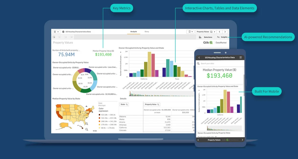
As teams scale, dashboards quickly become cluttered, confusing, or outright ignored. The tools that worked for a five-person startup often collapse under the weight of a fifty-person organization. Avoiding these five common dashboard mistakes can save your growing team from bad data habits and keep everyone aligned on what actually matters.
1. Trying to Show Everything at Once
The biggest mistake growing teams make is treating the dashboard like a data firehose. When you cram every possible metric onto one screen, nothing stands out. Executives scroll past dozens of charts searching for the one number they actually need. Instead, design your dashboard around a clear purpose—whether that's tracking weekly revenue, monitoring customer churn, or overseeing pipeline health. AI can help by suggesting only the most relevant KPIs for each role.
More data does not mean better decisions. A focused dashboard with five key metrics often drives more action than a cluttered screen with fifty.
2. Relying on Stale Data
A dashboard that updates weekly or monthly is just a prettier spreadsheet. Growing teams move fast, and decisions made on last week's numbers are decisions made in the dark. Connect your dashboards to live data sources—CRMs, ad platforms, databases—so every refresh shows the current state of the business. If your sales team is reviewing quarterly forecasts based on data from three weeks ago, you are already behind.
- Set up automated refreshes to eliminate manual updates
- Display the last refresh timestamp so everyone trusts the data
- Flag anomalies in real-time instead of discovering them in retrospect
- Schedule alerts for critical metrics that cross defined thresholds
3. Ignoring Your Audience
A dashboard built for a data analyst is incomprehensible to a sales manager. Growing teams often create one monolithic dashboard for everyone, which serves no one well. Segment your views by role and intent. Finance needs precision and cost data, marketing wants campaign ROI, and executives need high-level summaries. AI can generate role-specific dashboards from the same data source, giving each team exactly what they need without drowning them in irrelevant metrics.
The best dashboard in the world is useless if nobody on your team can read it, trust it, or act on it. Design for the audience, not the data.
4. Skipping the "Why" Behind the "What"
A dashboard that only shows numbers without context breeds confusion. If revenue dropped 15% this week, your team needs to know why—not just that it happened. Growing teams often forget to layer in explanatory context, leaving managers to guess or scramble for answers. Build dashboards that highlight the cause alongside the effect. Show the channel breakdown, the regional variance, or the product line shift automatically, so every dip or spike comes with an explanation ready to go.
5. Treating Dashboards as One-and-Done Projects
The biggest mistake of all is building a dashboard and calling it finished. As your team grows, your data needs evolve. New metrics become critical; old ones become noise. Successful growing teams treat their dashboards as living tools that adapt weekly. Review what your team is actually using, retire irrelevant charts, and keep iterating. AI simplifies this by learning from how users interact with the dashboard and suggesting improvements over time.